Radar has developed a new packaging design for the semi-finished products "Siberian Delicacy"

Name "Siberian Delicacy " reflects not only the essence of the brand, but also its main idea: real dumplings and frozen semi-finished products from Siberia, original authentic products based on traditional Siberian recipes. Their designers reflected them in the rethought mission: to use the brand's products to unite people at one table, to discover the authentic taste of Siberian delicacies.
The updated positioning and unique advantages – local products, raw materials and ingredients – were emphasized without unnecessary flirting in the straightforward brand slogan: “Origin determines taste”. The brand’s noticeable RTB is in the satiety, caloric content and unique Siberian fillings: pine nuts and wild mushrooms in pelmeni and vareniki; raspberries, sea buckthorn, cloudberries and other local berries in pancakes.
When creating the packaging design, we sought to reflect not only the naturalness of the products, but also the authenticity of real Siberian recipes. Having studied the competitive environment, we settled on a noble dark green color. The most natural of all possible.
The main part of the packaging is taken up by illustrations reflecting the filling. The outline shapes of the filling for pelmeni and vareniki are filled with an abstract image of Siberian mountains, clear skies and local patterns. Graphic branches and leaves “floating” around enhance the natural effect. This design clearly reflects the quality and taste of the product, making the packaging stand out on the shelf.
Matte varnish on a green background emphasizes the gloss of the illustrations. Color coding of the pattern and windows on the end of the package help to easily find your favorite product. The information block was supplemented with infographics, clearly reflecting the preparation process.
Test for Atnibiotics in Milk
 PIONEER MEIZHENG BIO-TECH (5 in1) JC0586 - Antibiotic tests 5 in 1 / Rapid tests for determining the residual amount of β-lactams, tetracyclines and cephalexin in milk, whey
 Rapid 4 in 1 tests for determining the residual amount of neomycin, kanamycin, gentamicin, spectinomycin in milk, whey
 PIONEER MEIZHENG BIO-TECH (5 in1) JC0871/ Rapid tests for the determination of the residual amount of β-lactams, tetracyclines, chloramphenicol, streptomycins, ceftiofur in milk, whey.
 ANTIBIOTICS / ELISA TESTS
 PIONEER MEIZHENG BIO-TECH (5 in1) JC1165 / Rapid tests for the determination of the residual amount of halofuginone, flavomycin, novobiocin, flunixin, dexamethasone / prednisolone in milk, whey
 Express tests for determining the residual amount of β-lactams, tetracyclines, chloramphenicol, streptomycins in milk, whey
- Rapid tests for determining the residual amount of tetracyclines in meat
- Rapid tests for determining the residual amount of chloramphenicol in meat
- Express tests for determining the residual amount of β-lactams and tetracyclines in milk, whey
- Rapid tests for fluoroquinolone, erythromycin, lincomycin, tillosin and tilmycosin residues in milk, whey
Laboratory equipment
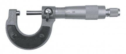 Smooth micrometers MK
 Stationary thermohygrometer IVA-6B2 (Russia)
 Hygrometers VIT-1, VIT-2 (Russia)
 Moisture content analyzer MB23 (Ohaus)
 Magnetic stirrer Tagler MM-135 (without heating)
 Homogenizer (laboratory blender) BagMixer
- Abbe refractometers Atago
- Steam autoclaves/sterilizers GC (Russia)
- Dry-air thermostats TS (SKTB, Smolensk)
- PAL series digital pocket refractometers (Atago, Japan)
- Mobile table BA-CL- X.X PS TR
- Scrubber "KELTRAN" (KELTRUN)
- Low wall table with drawers BA-CL-X.X SPn-ya TR
- Laboratory heating plate PRN-6050-2
- Butyrometers for milk, cream, skim milk and buttermilk
Packing
 Backed Foil
 KH PACK® bag making paper
 Siliconized paper for hygiene products
 Korreks for desserts
 Laminating paper KH PACK®
 GableTop aseptic packaging
- Paper for micro-ribbed
- KH PACK® Straight Packing Paper
- Ice cream chopsticks
- Carton
- KH PACK® tartlet paper
- Laminating paper KH PACK®
- Cover
- Korreks for confectionery
- Grease and barrier paper KH PACK®
Additional Products
 Ice cream sticks Standard 114
 Ice cream sticks Standard 93
 General purpose environment of SPC "Biocompass-S" (Uglich)
 Auxiliaries for sugar products
 Ice cream sticks (with logo)
 Pepsin whey pork
- Ice cream sticks (round)
- Petri dish 90 mm
- Wafer cup and cone
- Ice cream sticks Magnum (curly)
- J-Bottom technology
- Cartons for milk and dairy products
Consumables
 Pre-milking udder cleaner (20 l)
 Pump for artificial ventilation of the lungs
 Cassettes for DCC somatic cell counter
 Napkin reusable for wiping the udder
 Latex gloves (long cuff with roller), (color blue, pack of 50 pieces)
 Udder cleaner after milking (20 l)
- Foam cup for udder treatment
- Alkaline detergent (20l / 24kg)
- Plastic bracelet
- Spare pacifier
- Electric Cattle Driver
- Mug for milking the first streams of milk.
- Foaming cup for udder treatment
- Hoof bath
- Reusable plastic syringe
Microbiology
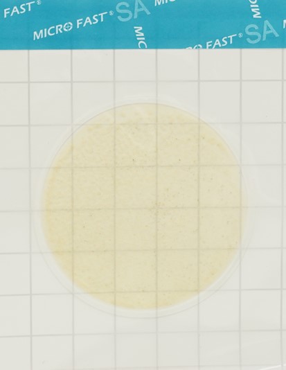 Substrate for determining the number of staphylococci (Catalog number LR1005) MicroFast® Staphyloccocus aureus Count Plate
 Yeast & Mold Count Plate (cat. no. LR1003) MicroFast® Yeast & Mold Count Plate
 MicroFast® Staphyloccocus aureus Confirmation Plate Staph.aureus Confirmation Plate (cat. no. LR1005Q)
 MicroFast® Bacillus cereus Count Plate (catalog number LR1010)
 MicroFast® Lactic Acid Bacteria Count Plate (Part Number LR1312)
 MicroFast® Coliform & E.coli Count Plate
- MicroFast® Salmonella Count Plate (SAL), for the determination of Salmonella in food and environmental samples (Catalog #LR1006)
- MicroFast® Enterobacteriaceae Count Plate (cat. no. LR1011)
- MicroFast® Microbiological Substrates
- MicroFast® Environmental Listeria Count Plate
- Substrate for determining QMAFAnM (catalog number LR1001)
- Coliform Count Plate (catalog number LR1002) MicroFast® Coliform Count Plate
- Substrate for accelerated determination of QMAFAnM, (catalog number LR1321)
Our News
 Калининградская область заинтересована в обмене опытом с Беларусью в мелиорации и закупке техники01.10.2025
 Belarusian exports of dry milk products to Myanmar quadrupled in the first half of the year. 01.10.2025
 В ОАО "Агро-Колядичи" умеют получать завидные урожаи30.09.2025
- "Россь" не рассчитывает на авось30.09.2025
- Куда инвестирует бизнес? Узнали, какой город в Беларуси выбрал для вложений производитель протеиновых батончиков30.09.2025
- БУТБ обеспечит платформу для взаимодействия белорусского и индонезийского бизнеса28.09.2025
- В ОАО "Святая Воля" в Ивацевичском районе за полгода выручка на каждого работника составила Br98 тыс.27.09.2025
- Газ на пятилетку, вторая АЭС, защита общего рынка и Украина. Подробности переговоров Лукашенко и Путина27.09.2025
- Record-breaking animals are being raised at the Ross breeding farm in the Volkovysk district.26.09.2025
- Шашлычок, мясные шарики, гуляш, борщ. Посмотрели, чем кормят детей в школе и сколько это стоит26.09.2025
- At OJSC "Svyataya Volya" in the Ivatsevichi district, revenue per employee over the past six months amounted to Br98 thousand.26.09.2025
- OAO Ostromechevo invested over $18 million in livestock development.26.09.2025
- Farmers at Rogoznyansky JSC in Zhabinka District increased their grain yields by more than a third.25.09.2025
- В ОАО "Агро-Колядичи" самой урожайной культурой оказался ячмень25.09.2025
- Алтайский край заинтересован в развитии биржевой торговли с Беларусью25.09.2025
- Белорусские сахарные заводы начали экспортировать свекловичный жом в ОАЭ через биржу24.09.2025
Articles
 Суд подтвердил правомерность действий Россельхознадзора по отношению к мясоперерабатывающему предприятию из Архангельской области01.10.2025
 В Приморье владельцу коз вынесено предупреждение за игнорирование ветеринарных мероприятий01.10.2025
 Мировой рынок органических и натуральных продуктов вырастет до $84 млрд к 2033 году01.10.2025
- В Иркутской области Россельхознадзор провёл анализ более 140 проб пищевой продукции01.10.2025
- Тенденции и вызовы в агропромышленном комплексе России обсуждали на выставке «Агропродмаш-2025»01.10.2025
- Россельхознадзор открывает новые рынки для агропромышленной продукции01.10.2025
- Делегация Татарстана успешно посетила выставку CIFA в Китае01.10.2025
- Советы по борьбе с опасными заболеваниями животных: страны СНГ предпринимают совместные меры01.10.2025
- Проблемы "Токаревской птицефабрики": Новый иск на 64,8 млн рублей01.10.2025
- США могут стать вторым по величине рынком сбыта парагвайской говядины01.10.2025
- Ожидается рост производства свинины на Филиппинах01.10.2025
- Торговля агропродовольственными товарами ЕС остаётся стабильной, несмотря на рост цен01.10.2025
- Белгородская область провела всероссийскую конференцию по биобезопасности в АПК30.09.2025
- Рост производства мяса и молока в Ивановской области: инвестпроекты подстегивают отрасль30.09.2025
- Ямал демонстрирует умеренную инфляцию на фоне снижения цен на овощи и яйца30.09.2025
- Калининградские инспекторы предотвратили ввоз крупной партии птицеводческой продукции из Китая30.09.2025
Economics
 10 reasons to take a deposit04.05.2025
 Губернатор назвал меры по борьбе с топливным кризисом в Хабаровском крае02.10.2025
 Bloomberg узнал о плане G7 значительно ужесточить санкции против России02.10.2025
- G7 заявила о проработке использования всей суммы российских активов02.10.2025
- Фон дер Ляйен заявила о смене подхода к санкциям против России02.10.2025
- США раскрыли долю поставляемого из России топлива для ядерных реакторов01.10.2025
- Евросоюз частично восстановит санкции против Ирана30.09.2025
- Yle узнал, что ЕС не планирует вносить российский никель в список санкций28.09.2025
- Иран сообщил о предложенной Штатами отсрочке санкций в обмен на уран28.09.2025
- Кремль отреагировал на планы ЕК изменить механизм продления санкций27.09.2025
- МИД ввел санкции против Британии и назвал ее меры «тришкиным кафтаном»27.09.2025
- Politico has learned that the European Commission has proposed changing the sanctions extension mechanism.26.09.2025
- В Венгрии подсчитали убытки из-за отказа от российского газа26.09.2025
- The FT reported on the German cellist's "too bold" ties to Russia.26.09.2025
- Bloomberg назвал условие Индии для отказа от российской нефти26.09.2025
- EUObserver узнал о нежелании ЕС закрываться от российских туристов25.09.2025
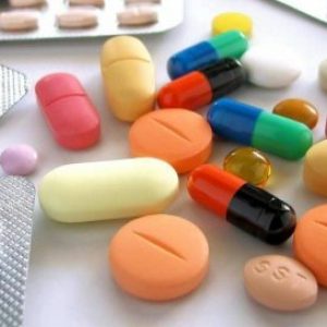
Antibiotics in Milk
 В Британии предупредили о риске для миллионов из-за супербактерий06.01.2025
- Moscow court sides with Indian company in dispute with Health Ministry26.11.2024
 Scientists estimate increase in mortality due to drug-resistant bacteria29.10.2024
- Antibiotics for livestock and pesticides found in poisoned family's home29.10.2024
- Izvestia reported on the shortage of widely used antibiotics in Russia29.10.2024
- The Ministry of Health called data on the shortage of antibiotics unreliable29.10.2024
- Scientists warn of threat of return to pre-penicillin times29.10.2024
- The Ministry of Health explained how attitudes towards antibiotics changed during the pandemic07.05.2024
- WHO explains the risks of taking antibiotics "just in case"06.05.2024
- Doctors warn of bad practices after government decision on antibiotics25.04.2024
- The Ministry of Health removed antibiotics and hormones from the standard treatment of ARVI25.04.2024
- Antibiotics in oil: myth or reality?06.03.2024
- Antibiotics in sour cream: myth or reality?05.03.2024
- Antibiotics in goat milk: effects, problems and control measures16.02.2024
- The Japanese will stop producing the popular antibiotic vilprafen in Russia23.12.2023
- Antibiotics in Milk21.12.2023
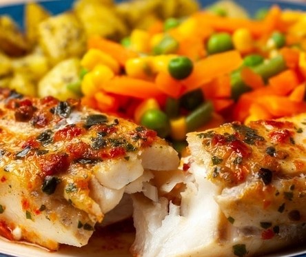
Antibiotics in Meat
 Antibiotics in pollock25.02.2024
 Antibiotics in herring: myth or reality?12.02.2024
 Antibiotics in perch10.02.2024
- Antibiotics in sprat: facts and myths10.02.2024
- Antibiotics in tuna: an important health and environmental issue09.02.2024
- Antibiotics in meat30.01.2024
- Antibiotics in chebureks: myth or reality?29.01.2024
- Antibiotics in cutlets: problem or myth?18.01.2024
- Antibiotics in Chicken: Where Are the Highest Concentrations?17.01.2024
- Antibiotics in carp17.01.2024
- Where Are More Antibiotics in Chicken: Reality and Cautions16.01.2024
- Antibiotics in Salmon: Safety and Product Quality16.01.2024
- Antibiotics in Turkey15.01.2024
- Antibiotics in Sal: Reality and Safety Issues15.01.2024
- Antibiotics in Fried Dumplings: Facts, Risks and How to Stay Safe15.01.2024
- Antibiotics in sausages14.01.2024
10 Interesting Facts
 Antibiotics in Coffee: Myths and Reality03.05.2025
 Forged forks: 10 interesting facts16.05.2024
 Swimming pool and weight loss: 10 interesting facts10.03.2024
- Tests for antibiotics in milk - 10 interesting facts07.03.2024
- Cleaning the kettle from scale, 10 interesting facts...06.03.2024
- Antibiotics in beer: 10 interesting facts04.03.2024
- Wild boar, how to survive...01.03.2024
- Purulent mastitis, 10 interesting facts27.02.2024
- Lemon and alcohol: 10 interesting facts25.02.2024
- Mint - 10 interesting facts25.02.2024
- Wild boar, 10 interesting facts20.02.2024
- Wild boar and domestic pig: comparison and advantages20.02.2024
- Cottage cheese, 10 interesting facts20.02.2024
- 10 Interesting Facts About Milk19.02.2024
- How to Clean a Toilet - 10 Interesting Facts (Acid vs Alkaline)18.02.2024
- Goat's milk: 10 interesting facts16.02.2024
Diseases of cattle
 Dicroceliosis in cattle09.03.2024
 Demodicosis in cattle01.03.2024
 Purulent mastitis of cattle27.02.2024
- Hypodermatosis in cattle20.02.2024
- Hemonchoz in cattle11.02.2024
- Bursitis in cattle30.01.2024
- Brucellosis in cattle29.01.2024
- Bronchopneumonia in calves27.01.2024
- Bronchitis in cattle26.01.2024
- Mortellaro disease in cattle24.01.2024
- White muscle disease in cattle23.01.2024
- Babesiosis in cattle22.01.2024
- Cattle acidosis20.01.2024
- Arthritis in cattle20.01.2024
- Anaplasmosis in cattle18.01.2024
Misc
 Antibiotics for coughs: when they are needed and when they are not11.02.2024
 Из-за пьяного бесправника погибли два человека. Следователи раскрыли подробности ДТП в Браславском районе02.10.2025
 В Бресте нетрезвая женщина попала под машину02.10.2025
- "Картонная сверхдержава". С чем Польша готова шагнуть в 2026-й?02.10.2025
- A drunk mechanic hit a Gomel resident with his own car. The Investigative Committee has revealed details of the case.01.10.2025
- Хулиганство в интернете и реальной жизни. Верховный Суд обновил разъяснения для правоприменителей30.09.2025
- Compensation for moral damages, 4 years in prison. The perpetrator of a fatal accident near Gomel has been sentenced.30.09.2025
- She stabbed her partner in the back. The Investigative Committee has revealed details of the criminal case in Novopolotsk.27.09.2025
- За смену - десятки вызовов. Сотрудники ППС о спецзаданиях и необычных случаях 27.09.2025
- Как победить "осенний синдром"? Очень простые советы для хорошего самочувствия27.09.2025
- В Беларуси перенесены сроки введения прослеживаемости и маркировки товаров 26.09.2025
- Что является одной из основных причин травмирования на производстве, рассказали в ФПБ25.09.2025
- Минчанин лишился крупной суммы и золотого слитка после неудачного свидания 24.09.2025
- В центре внимания пешеходы и велосипедисты. ГАИ усилила контроль за соблюдением ПДД в Минском районе 24.09.2025
- Навигационные пломбы для отслеживания перевозок начнут применять на всей территории ЕАЭС24.09.2025
- В Минске пьяный водитель повредил девять припаркованных автомобилей24.09.2025
Cloud of Tags
ИнвестицииКрупный рогатый скотПитаниеМоскваФранцияЭкономикаИсследованияПтицефабрикаСвининаКрупного рогатого скотаМясо птицыПоддержкаНедвижимостьРоспотребнадзорЯпонияКартофельРодителиУзбекистанКоронавирусВладимир ПутинКофеПесковАнтибиотиковПродовольствиеБолезньВеликобританияМинфинУрожаяЛечениеИнфляцияЕгипетОтпускИммунитетCOVID-19министр сельского хозяйстваЗаконКарантинДмитрий песковСырыМинсельхозСудЖивотноеЭкспортБразилияДолларЛекарстваЦентробанкЕАЭСКитайМинздравУборкаBloombergПодмосковьеЕврокомиссияГовядинаБеларусьЯйцаДжо БайденЦеныПрокуратураДиректорМЧСЕСДоходыВакцинацииВостокТАССРаботаУкраинеВирусНефтьПольшаТатарстанОбщепитПродукцияМужчиныБройлерГазпромБизнесСельское хозяйствоАвстралияСШАУченыеЗависимостьПензенской областиДеньгиAppleКРСRussiaЗдоровьеReutersРоссияВластиМясокомбинатПроизводство молокаАлкогольного опьяненияСпутник vЗаконопроектВ китаеВыручкаФермерАлександр ЛукашенкоВеликобританииКризисНовостиMicrosoftАлкогольГовядинуДетиГерманияКлиматМаслоСмертьСубсидииКолбасыТурцияМолокоПравительствоСанкцииВьетнамFacebookTelegramПродукты питанияКредитСанкт-ПетербургGoogleРоссиянеРубльОнлайнКанадаИмпортПроизводство мясаАзербайджанКазахстанРосстатМясоПраздникРоссельхознадзорФрукты2024МинскВакцинацияИталияЗеленскийЗапретСотрудники ГАИАЧСУкраинаОрганизмТребования