New local brand "Irkurochkino" from A.STUDIO

Agents faced the task of creating customer trust against the backdrop of high competition from long-established players in the market. As a result of the brand audit, the A.STUDIO team found out that there is a tendency to link names to the location. Considering the loyalty of customers, it was decided to choose a name that emphasizes local production. The new brand "Irkurochkino" harmoniously combines geographic reference with the product.
Regional competitors often use light colors in combination with yellow, so white and the corporate green color were chosen to highlight the shelves. The packaging design uses a pattern with vegetables and greens, which facilitates navigation. The logo with the image of a chicken unites all SKUs and forms a single identity, and a guidebook was developed for ease of use of the corporate style.
Test for Atnibiotics in Milk
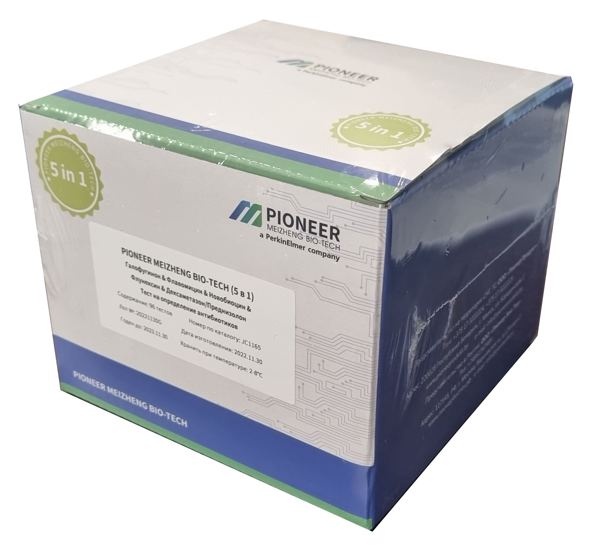 PIONEER MEIZHENG BIO-TECH (5 in1) JC1165 / Rapid tests for the determination of the residual amount of halofuginone, flavomycin, novobiocin, flunixin, dexamethasone / prednisolone in milk, whey
 ANTIBIOTICS / ELISA TESTS
 Rapid tests for determining the residual amount of tetracyclines in meat
 Express-tests PIONER 5 in1 for the determination of thiamphenicol, meloxicam, colistine, trimethoprim, sulfonamides
 Express tests for determining the residual amount of β-lactams and tetracyclines in milk, whey
 Rapid tests PIONER 5 in 1 for the determination of sulfonamides, tylosin, tilmicosin, lincomycin, erythromycin, fluoroquinolones
- PIONEER MEIZHENG BIO-TECH (5 in1) JC0586 - Antibiotic tests 5 in 1 / Rapid tests for determining the residual amount of β-lactams, tetracyclines and cephalexin in milk, whey
- Express tests for determining the residual amount of β-lactams, tetracyclines, chloramphenicol, streptomycins in milk, whey
- TEST KIT for determination of inhibitory agents PIONEERPRODUKT® DASH-TEST, WC0040
- PIONEER MEIZHENG BIO-TECH (5 in1) JC0871/ Rapid tests for the determination of the residual amount of β-lactams, tetracyclines, chloramphenicol, streptomycins, ceftiofur in milk, whey.
Laboratory equipment
 Stopwatch mechanical stopwatch SOPpr
 "Keltran" (keltrun) - a complex for the determination of nitrogen and protein by the Kjeldahl method
 testo 206-pH2 - Pocket pH meter
 Staff table BA-CL- X.X SLP TR - a
 Milk analyzer Expert Super Breeding
 Tagler TSLM 1-8 milk centrifuge (without heating) (Russia)
- GP dry-air sterilizer (SKTB, Smolensk)
- Milk quality analyzer "Laktan 1-4M" isp. Mini
- Integral C-01 electronic stopwatch
- LOIP LAB-FH-Euro flask heater
- Lumitester SMART Luminometer
- MB25/MB27 moisture content analyzers (Ohaus)
- Smooth micrometers MK
- Mastic Milk Indicator Strips, 100 pcs
- Hydrometers for milk AM, AMT
Packing
 Paper for micro-ribbed
 Parchment
 Laminating paper KH PACK®
 Paper sacks
 KH PACK® bag making paper
 Plastic packaging for cakes and pastries
- Siliconized paper for hygiene products
- KH PACK® tartlet paper
- Korreks for desserts
- Salad dressings
- Ice cream chopsticks
- The paper packing fastened anticorrosive UNIK 14-70 THAT 5453-003-05773103-2005
- KH PACK® Straight Packing Paper
- Cover
- Grease and barrier paper KH PACK®
Additional Products
 Ice cream sticks (with logo)
 Ice cream sticks Magnum (curly)
 Petri dish 90 mm
 J-Bottom technology
 Auxiliaries for sugar products
 Ice cream sticks Standard 114
- GableTop aseptic packaging
- Pepsin whey pork
- General purpose environment of SPC "Biocompass-S" (Uglich)
- Wafer cup and cone
- Ice cream sticks (round)
- Ice cream sticks Standard 93
Consumables
 Pencils for marking animals
 Foaming cup for udder treatment
 Fall with a loop for cattle
 Electric Cattle Driver
 Rubber rings for castration
 Mug for milking the first streams of milk.
- Disposable udder wipe (udder paper).
- Pre-milking udder cleaner (20 l)
- Forged pitchforks
- Dosing syringe, hose attachment
- Mug for milking the first streams of milk, lengthwise
- Dosing syringe, bottle attachment
- Alkaline detergent (20l / 24kg)
- Plastic syringe 150ml
- Milk filter for fine purification of milk for 2, 5, 10 tons
Microbiology
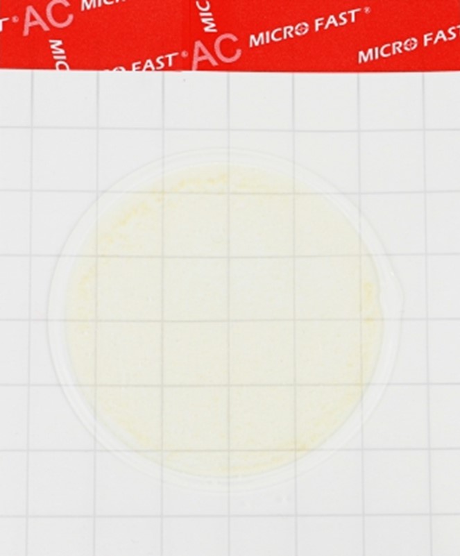 Substrate for determining QMAFAnM (catalog number LR1001)
 MicroFast® Staphyloccocus aureus Confirmation Plate Staph.aureus Confirmation Plate (cat. no. LR1005Q)
 Coliform Count Plate (catalog number LR1002) MicroFast® Coliform Count Plate
 MicroFast® Bacillus cereus Count Plate (catalog number LR1010)
 MicroFast® Enterobacteriaceae Count Plate (cat. no. LR1011)
 MicroFast® Microbiological Substrates
- MicroFast® Lactic Acid Bacteria Count Plate (Part Number LR1312)
- MicroFast® Environmental Listeria Count Plate
- MicroFast® Salmonella Count Plate (SAL), for the determination of Salmonella in food and environmental samples (Catalog #LR1006)
- Substrate for accelerated determination of QMAFAnM, (catalog number LR1321)
- MicroFast® Coliform & E.coli Count Plate
- Yeast & Mold Count Plate (cat. no. LR1003) MicroFast® Yeast & Mold Count Plate
- Substrate for determining the number of staphylococci (Catalog number LR1005) MicroFast® Staphyloccocus aureus Count Plate
Our News
 Бригадир КСУП "Племзавод "Россь" Волковысского района: мы все работаем на большой урожай21.09.2025
 Почти 40% биржевого экспорта белорусской сельхозпродукции в Россию пришлось на долю Московской области 20.09.2025
- БУТБ будет сотрудничать с торгово-промышленной палатой Камчатского края 19.09.2025
- Беларусь и Владимирская область проработают новые направления сотрудничества в биржевой сфере18.09.2025
- The advanced farm of JSC "Gorodilovo" uses the work of scientists and rewards with a trip to the sea18.09.2025
- Беларусь и Египет договорились об активизации диалога в биржевой сфере 17.09.2025
- Минсельхозпрод изменил минимальные экспортные цены на отдельные товары17.09.2025
- Поставки продукции и совместные проекты. Гомельская область и провинция Цзилинь развивают партнерство 17.09.2025
- Промкооперация, АПК, медицина. Определены ключевые направления работы Гродненской и Пензенской областей 17.09.2025
- Сколько сельхозпродукции произвели в Беларуси за январь-август этого года, рассказали в Белстате 17.09.2025
- С работников АПК в Могилевском районе необоснованно удерживали деньги, вмешалась прокуратура17.09.2025
- Belarusian food exports increased by 13% in the first half of the year13.09.2025
- Prizes for the 206th round of the game "Good Luck in Addition!" have been awarded.12.09.2025
- From unique treats to a wish tree. What surprised at the Cheese Festival of the "Molochny Mir" in Grodno12.09.2025
- A modern dairy farm for 777 heads of dairy cattle is being built in the Svisloch district11.09.2025
- Валовое производство молока в Беларуси выросло на 6,5%11.09.2025
Articles
 Россия зарегистрировала новый штамм вируса, вызывающего диарею у крупного рогатого скота19.09.2025
 Россия и Китай нацелились на расширение торговли агропродовольственной продукцией19.09.2025
 Новый дрон для мониторинга скота: инновации в агросекторе от МАИ19.09.2025
- Меры по предотвращению распространения эпизоотий обсудили на заседании вице-премьера РФ19.09.2025
- Группа «ПРОДО» запускает программу кросс-функционального обучения для работников птицефабрик19.09.2025
- Бывший управляющий птицефабрики должен вернуть 4,8 млн рублей из-за неэффективного управления19.09.2025
- The Ministry of Economic Development is recording deflation in the Russian food market amid rising global prices.19.09.2025
- В Краснооктябрьском сельском поселении введены ограничения из-за бруцеллеза19.09.2025
- Рост цен на говядину в России продолжится: эксперты прогнозируют дальнейшее подорожание19.09.2025
- Производство хамона в Ленобласти расширится на 1,3 миллиарда рублей19.09.2025
- Челябинский фермер погасил долг по ДТП продукцией собственного хозяйства19.09.2025
- Качество куриного мяса в Нижегородской области вызывает опасения: выявлены сальмонеллы и листерии19.09.2025
- Новый порядок GMP-инспекции для производителей ветеринарных препаратов вступит в силу в 2026 году19.09.2025
- Фермер из Коми удвоил производство мяса благодаря государственному гранту18.09.2025
- Предпринимателя в Кирове оштрафовали за продажу шаурмы с сомнительным мясом18.09.2025
- Ставропольский край нацелен на увеличение экспорта сельскохозяйственной продукции в Африку18.09.2025
Economics
 10 reasons to take a deposit04.05.2025
 Зеленский ввел санкции против внука де Голля, Мизулиной и Гуцул21.09.2025
 The European Commission has proposed lowering the price ceiling for Russian oil to $47.6 per barrel.20.09.2025
- Еврокомиссия предложила ограничить доступ России к технологиям ИИ20.09.2025
- В Испании поддержали использование активов России для помощи Украине20.09.2025
- ЕС намерен ввести санкции против платежной системы «Мир»20.09.2025
- Democrats called for tougher sanctions against Russian energy companies20.09.2025
- Reuters узнал предложение ЕК по точной дате запрета российского СПГ19.09.2025
- ЕК сообщила, что «скоро будут подробности» по санкциям против России19.09.2025
- Handelsblatt reveals EU plans to tighten sanctions against Russia18.09.2025
- Путин продлил действие контрсанкций на два года18.09.2025
- В ЕС заподозрили ловушку в условии Трампа о Китае и пошлинах17.09.2025
- The Foreign Ministry explained why Russia does not raise the issue of lifting sanctions with the US17.09.2025
- Роспатент отказал Renault в регистрации измененного товарного знака17.09.2025
- Песков заявил об открытости России к переговорам по Украине17.09.2025
- Bloomberg узнал сроки проработки новых санкций G7 против России17.09.2025
Antibiotics in Milk
 В Британии предупредили о риске для миллионов из-за супербактерий06.01.2025
 Moscow court sides with Indian company in dispute with Health Ministry26.11.2024
 Scientists estimate increase in mortality due to drug-resistant bacteria29.10.2024
- Antibiotics for livestock and pesticides found in poisoned family's home29.10.2024
- Izvestia reported on the shortage of widely used antibiotics in Russia29.10.2024
- The Ministry of Health called data on the shortage of antibiotics unreliable29.10.2024
- Scientists warn of threat of return to pre-penicillin times29.10.2024
- The Ministry of Health explained how attitudes towards antibiotics changed during the pandemic07.05.2024
- WHO explains the risks of taking antibiotics "just in case"06.05.2024
- Doctors warn of bad practices after government decision on antibiotics25.04.2024
- The Ministry of Health removed antibiotics and hormones from the standard treatment of ARVI25.04.2024
- Antibiotics in oil: myth or reality?06.03.2024
- Antibiotics in sour cream: myth or reality?05.03.2024
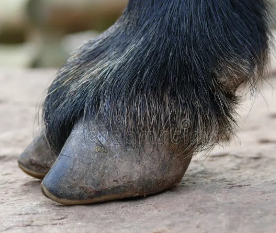
- Antibiotics in goat milk: effects, problems and control measures16.02.2024
- The Japanese will stop producing the popular antibiotic vilprafen in Russia23.12.2023
- Antibiotics in Milk21.12.2023
Antibiotics in Meat
 Antibiotics in pollock25.02.2024
 Antibiotics in herring: myth or reality?12.02.2024
 Antibiotics in perch10.02.2024
- Antibiotics in sprat: facts and myths10.02.2024
- Antibiotics in tuna: an important health and environmental issue09.02.2024
- Antibiotics in meat30.01.2024
- Antibiotics in chebureks: myth or reality?29.01.2024
- Antibiotics in cutlets: problem or myth?18.01.2024
- Antibiotics in Chicken: Where Are the Highest Concentrations?17.01.2024
- Antibiotics in carp17.01.2024
- Where Are More Antibiotics in Chicken: Reality and Cautions16.01.2024
- Antibiotics in Salmon: Safety and Product Quality16.01.2024
- Antibiotics in Turkey15.01.2024
- Antibiotics in Sal: Reality and Safety Issues15.01.2024
- Antibiotics in Fried Dumplings: Facts, Risks and How to Stay Safe15.01.2024
- Antibiotics in sausages14.01.2024
10 Interesting Facts
 Antibiotics in Coffee: Myths and Reality03.05.2025
 Forged forks: 10 interesting facts16.05.2024
 Swimming pool and weight loss: 10 interesting facts10.03.2024
- Tests for antibiotics in milk - 10 interesting facts07.03.2024
- Cleaning the kettle from scale, 10 interesting facts...06.03.2024
- Antibiotics in beer: 10 interesting facts04.03.2024
- Wild boar, how to survive...01.03.2024
- Purulent mastitis, 10 interesting facts27.02.2024
- Lemon and alcohol: 10 interesting facts25.02.2024
- Mint - 10 interesting facts25.02.2024
- Wild boar, 10 interesting facts20.02.2024
- Wild boar and domestic pig: comparison and advantages20.02.2024
- Cottage cheese, 10 interesting facts20.02.2024
- 10 Interesting Facts About Milk19.02.2024
- How to Clean a Toilet - 10 Interesting Facts (Acid vs Alkaline)18.02.2024
- Goat's milk: 10 interesting facts16.02.2024
Diseases of cattle
 Dicroceliosis in cattle09.03.2024
 Demodicosis in cattle01.03.2024
 Purulent mastitis of cattle27.02.2024
- Hypodermatosis in cattle20.02.2024
- Hemonchoz in cattle11.02.2024
- Bursitis in cattle30.01.2024
- Brucellosis in cattle29.01.2024
- Bronchopneumonia in calves27.01.2024
- Bronchitis in cattle26.01.2024
- Mortellaro disease in cattle24.01.2024
- White muscle disease in cattle23.01.2024
- Babesiosis in cattle22.01.2024
- Cattle acidosis20.01.2024
- Arthritis in cattle20.01.2024
- Anaplasmosis in cattle18.01.2024
Misc
 Antibiotics for coughs: when they are needed and when they are not11.02.2024
 Борьба с контрабандой, переориентация грузов. Как работают белорусские таможенники21.09.2025
- Как будут регулировать интернет-торговлю в Беларуси? МАРТ предложил обсудить проект указа 20.09.2025
- В Гродно работник СТО взял автомобиль, который сдали для химчистки, и попал в ДТП19.09.2025
- Основная причина пожаров в Могилевской области в этом году - неосторожное обращение с огнем 19.09.2025
- Вели себя неадекватно в зоопарке и снимали на видео: в Минске задержали двоих нарушителей порядка 19.09.2025
- В Гомельской области мужчина выстрелил из пневматики по ногам дочери, возбуждено уголовное дело 19.09.2025
- На Корсике самолет долго не мог приземлиться из-за уснувшего авиадиспетчера18.09.2025
- Прокуратура Верхнедвинского района выявила социально опасное положение ребенка после трансляции в TikTok18.09.2025
- Велосипедист погиб в ДТП с грузовиком в Вилейском районе18.09.2025
- ГАИ Могилевской области за прошедшие выходные оштрафовала 77 пешеходов 17.09.2025
- В Витебской области за выходные задержали 12 нетрезвых водителей17.09.2025
- "Белгоспищепром": наши производители напитков постоянно работают над освоением новых технологий17.09.2025
- "Это даже не проблема - это дисфункция!" Откуда берутся проблемы с эрекцией и что делать?14.09.2025
- Управляемое пьяным водителем авто врезалось в другое на перекрестке в Минске14.09.2025
- Пьяный минчанин-бесправник угнал такси и врезался в жилой дом13.09.2025
Cloud of Tags
АЧСКредитГовядинуЗаконОнлайнИнвестицииКрупный рогатый скотМясокомбинатУкраинаСШАТАССЛекарстваМинздравВьетнамКРСГовядинаКофеУборкаНовостиУзбекистанОтпускЦеныПензенской областиНедвижимостьРосстатБеларусьОрганизмПольшаЗависимостьПраздникДоходы2024ПитаниеСубсидииПравительствоБройлерМужчиныСотрудники ГАИМаслоЭкономикаПродукцияКлиматЗеленскийЗапретКрупного рогатого скотаУкраинеЛечениеГерманияЖивотноеВирусЗдоровьеКолбасыЕСДетиМолокоТребованияТурцияFacebookЕАЭСЕгипетГазпромАлкогольного опьяненияСмертьGoogleMicrosoftМясоПоддержкаЕврокомиссияАнтибиотиковРодителиРоссельхознадзорАвстралияКоронавирусСвининаПродукты питанияНефтьВеликобританииминистр сельского хозяйстваПрокуратураКризисВластиАзербайджанRussiaПродовольствиеЭкспортЦентробанкВостокДолларЯпонияПроизводство мясаФермерКанадаУрожаяРубльAppleИммунитетЯйцаИталияBloombergВладимир ПутинВакцинацииСпутник vОбщепитИсследованияРоссиянеДжо БайденВакцинацияАлександр ЛукашенкоКазахстанДеньгиТатарстанДмитрий песковФруктыМоскваМЧСПодмосковьеАлкогольCOVID-19ПесковМинскСырыКарантинTelegramИнфляцияМинфинРаботаФранцияСанкт-ПетербургСанкцииЗаконопроектМинсельхозВ китаеУченыеВеликобританияРоспотребнадзорИмпортБизнесРоссияReutersСудМясо птицыБолезньПтицефабрикаКитайВыручкаКартофельБразилияСельское хозяйствоПроизводство молокаДиректор