Ferma packed Miratorg pancakes
According to the authors of the project, the packaging design in the category presents many similar replicated solutions: the use of bright non-food colors, collaged unappetizing food zones, outdated typography.
The packaging developed by FERMA allowed the product to stand out on the shelf due to its unique style. In addition, the design solved the rest of the tasks assigned to the agency. The home character of pancakes is broadcast by the photo zone. The elements of the image - tablecloth, crockery - and elaborate color scheme create the impression of a sunny morning and evoke associations with a family breakfast.
At the same time, the compositional solution creates an emphasis on the food zone. This enhances the sensation of appetizing pancakes, emphasizes their quality and taste. The nature of the photo image is supported by the typography and informational elements of the packaging. Laconic icons allow the consumer to quickly select the desired product in the store. The overall style of the packaging noticeably highlights the product on the shelf.
Differentiation within the line is made due to the color scheme of the elements of the photographic image and typography - the palette changes in accordance with the filling of the pancakes.
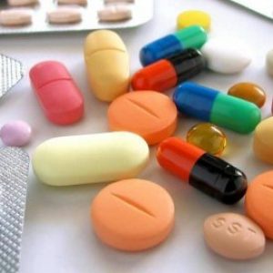
Test for Atnibiotics in Milk
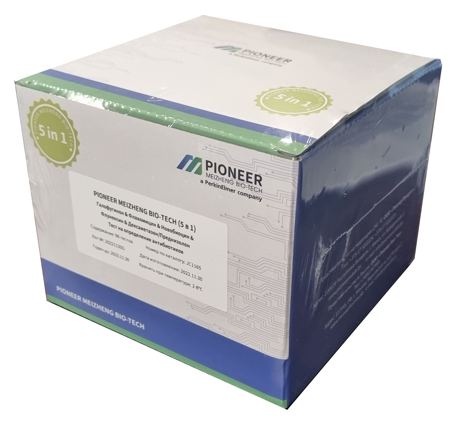 PIONEER MEIZHENG BIO-TECH (5 in1) JC1165 / Rapid tests for the determination of the residual amount of halofuginone, flavomycin, novobiocin, flunixin, dexamethasone / prednisolone in milk, whey
 Rapid tests for fluoroquinolone, erythromycin, lincomycin, tillosin and tilmycosin residues in milk, whey
 Rapid tests for determining the residual amount of chloramphenicol in meat
 PIONEER MEIZHENG BIO-TECH (5 in1) JC0871/ Rapid tests for the determination of the residual amount of β-lactams, tetracyclines, chloramphenicol, streptomycins, ceftiofur in milk, whey.
 TEST KIT for determination of inhibitory agents PIONEERPRODUKT® DASH-TEST, WC0040
 Rapid tests for determining the residual amount of tetracyclines in meat
- PIONEER MEIZHENG BIO-TECH (5 in1) JC0586 - Antibiotic tests 5 in 1 / Rapid tests for determining the residual amount of β-lactams, tetracyclines and cephalexin in milk, whey
- Express tests for determining the residual amount of β-lactams and tetracyclines in milk, whey
- Express-tests PIONER 5 in1 for the determination of thiamphenicol, meloxicam, colistine, trimethoprim, sulfonamides
- Rapid 4 in 1 tests for determining the residual amount of neomycin, kanamycin, gentamicin, spectinomycin in milk, whey
Laboratory equipment
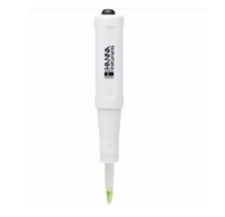 pH electrodes Hanna Instruments (Germany)
 Laboratory table on supporting pedestal BA-CL-X.X SLv-t TR -a
 Steam autoclaves/sterilizers GC (Russia)
 Piston oil sampler (d=20 mm, h cylinder=25 mm)
 Abbe refractometers Atago
 Heating plate Tagler PN-4030MK
- Testo 206-pH1 - Pocket pH meter (0..14 pH)
- Indicator strips "Total water hardness", 25 pcs.
- LOIP LH-1xx Fixed volume flask heater (up to +400 °C)
- Laboratory heating plate PRN-6050-2
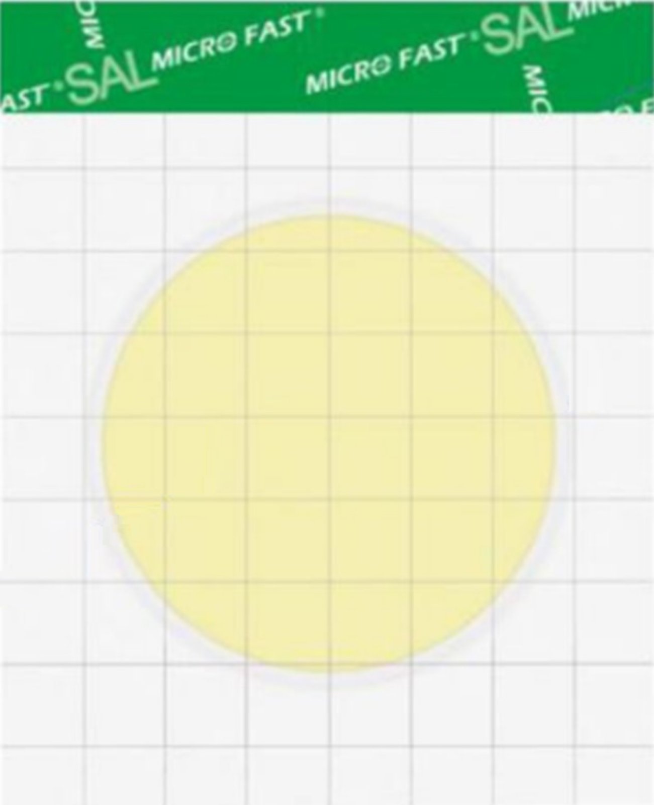
- MICROFAST® underlays
- Electronic thermometer LT-300-H-TC
- HM Series Rotary Homogenizers
- Laboratory blender Waring (USA)
- Indicator strips "Peroxide-25 mg", "Peroxide - 1000 mg", 100 pcs.
Packing
 Siliconized paper for hygiene products
 Cover
Cover Grease and barrier paper KH PACK®
 Paper sacks
 Carton
 The paper packing fastened anticorrosive UNIK 14-70 THAT 5453-003-05773103-2005
- KH PACK® bag making paper
- GableTop aseptic packaging
- Korreks for confectionery
- Ice cream chopsticks
- Plastic packaging for cakes and pastries
- Skiving and Hemming Technology
- Laminating paper KH PACK®
- KH PACK® tartlet paper
- Korreks for desserts
Additional Products
 Ice cream sticks (round)
 Petri dish 90 mm
 Ice cream sticks Magnum (curly)
 J-Bottom technology
 Ice cream sticks Standard 114
 Wafer cup and cone
- General purpose environment of SPC "Biocompass-S" (Uglich)
- Auxiliaries for sugar products
- Ice cream sticks Standard 93
- Ice cream sticks (with logo)
- Pepsin whey pork
Consumables
 Plastic syringe 150ml
 Veterinary Needles Reusable
 Cassettes for DCC somatic cell counter
 Disposable nitrile gloves (packing 100 pieces)
 Plastic bracelet
 Dosing syringe, hose attachment
- Veterinary glove to the shoulder and through the neck
- Spare pacifier
- Mug for milking the first streams of milk.
- Foaming cup for udder treatment
- Milk filter for fine purification of milk for 2, 5, 10 tons
- Sticky fly trap, 25cm*10m
- Disposable udder wipe (udder paper).
- Milk filters - primary cleaning
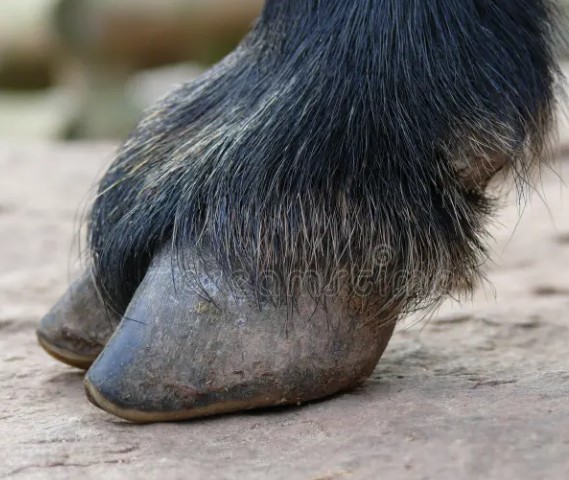
- Hoof bath
Microbiology
 MicroFast® Salmonella Count Plate (SAL), for the determination of Salmonella in food and environmental samples (Catalog #LR1006)
 Substrate for accelerated determination of QMAFAnM, (catalog number LR1321)
 MicroFast® Enterobacteriaceae Count Plate (cat. no. LR1011)
 MicroFast® Microbiological Substrates
 Substrate for determining the number of staphylococci (Catalog number LR1005) MicroFast® Staphyloccocus aureus Count Plate
 MicroFast® Bacillus cereus Count Plate (catalog number LR1010)
- MicroFast® Staphyloccocus aureus Confirmation Plate Staph.aureus Confirmation Plate (cat. no. LR1005Q)
- MicroFast® Lactic Acid Bacteria Count Plate (Part Number LR1312)
- Substrate for determining QMAFAnM (catalog number LR1001)
- Coliform Count Plate (catalog number LR1002) MicroFast® Coliform Count Plate
- MicroFast® Coliform & E.coli Count Plate
- Yeast & Mold Count Plate (cat. no. LR1003) MicroFast® Yeast & Mold Count Plate
- MicroFast® Environmental Listeria Count Plate
Our News
 Порядок там, где постоянно работают в тонусе. Сергеенко посетил сельхозпредприятия Браславского района31.10.2025
 Строго придерживаться технологии и болеть за свое дело. Как исключить падеж скота, рассказал председатель СПК31.10.2025
 Как жили дети войны? // Про блюдце замороженного молока, школу, недетские пытки и подвиги30.10.2025
- Минсельхозпрод рассказал, какие белорусские продукты наиболее востребованы в Африке30.10.2025
- В Минской области намолочено 2,5 млн тонн зерна вместе с рапсом и кукурузой29.10.2025
- Personal responsibility, modernization. What measures is the Ministry of Agriculture and Food taking to reduce mortality?29.10.2025
- На БУТБ началась реализация желатина для фармацевтической промышленности29.10.2025
- Проверьте, знаете ли вы историю на уровне ЕГЭ26.10.2025
- Lukashenko spoke out against simple solutions for the Vitebsk region and actions along the path of least resistance. 25.10.2025
- Производство молока, инвестиции. Какие точки роста на пятилетку видит руководство Витебской области25.10.2025
- Первичная задача - дойти до каждого сельхозпредприятия. Депутат о развитии АПК Витебской области25.10.2025
- Совместные проекты и обмен опытом. В каких направлениях Беларусь и Казахстан готовы развивать сотрудничество в АПК 24.10.2025
- Беларусь и Алтайский край намерены увеличить биржевую торговлю сельхозпродукцией24.10.2025
- Минск и Алжир готовят переговоры на высшем уровне. Почему Беларусь нацелилась на Север Африки?24.10.2025
- "Ambitious plans." Brest Regional Executive Committee on the region's contribution to food security in the Union State. 23.10.2025
- Decree: Regional executive committees are granted the right to form agricultural raw material zones23.10.2025
Articles
 Цены на борщевой набор снизились, яйца и мясо подорожали в Тульской области31.10.2025
- В Тюменских кафе выявили нарушения при использовании мяса без ветеринарных документов31.10.2025
 Цены на говядину в Братске возросли более чем на 25%31.10.2025
- Цены на курицу выросли на 30%: новая реальность для семейного бюджета31.10.2025
- Билибинская птицефабрика значительно увеличила объем производства яиц31.10.2025
- 70 студентов прошли практику на крупнейшем птицеводческом комплексе в России31.10.2025
- Развитие торговых отношений России и Китая в экспортном секторе мяса31.10.2025
- Прогноз роста производства индейки в России на 2025-2026 годы31.10.2025
- США: NCC представляет свои соображения по «ультраобработанным продуктам питания»31.10.2025
- США: Трамп утверждает, что пошлины способствовали процветанию скотоводов, но экономисты говорят, что картина сложнее31.10.2025
- Франция запретила экспорт крупного рогатого скота и проведение корриды в связи с распространением вируса нодулярного дерматита31.10.2025
- Спрос на продукцию птицеводства в ЕС остается высоким, а цены выросли на 13%31.10.2025
- Восстановление производства свинины в России: оптимистичные прогнозы до конца 2026 года29.10.2025
- Цены на говядину в Ростовской области резко увеличились29.10.2025
- Meat production has increased in the Angara region, but milk yields are declining.29.10.2025
- В Красноярске приостановили работу павильона из-за нелегальной продажи мяса29.10.2025
Economics
 10 reasons to take a deposit04.05.2025
 Михельсон предупредил о росте цен на газ в ЕС при отказе от СПГ из России31.10.2025
 Швейцария ввела дополнительные санкции против России и Белоруссии31.10.2025
- Дмитриев предупредил ЕС об убытках после запрета на сантехнику из России31.10.2025
- A tanker carrying Russian oil bound for India has been turned back after US sanctions.30.10.2025
- Минфин США снял санкции с Милорада Додика и членов его семьи30.10.2025
- Уитакер заявил об альтернативных санкциям мерах давления США на Россию29.10.2025
- ЛУКОЙЛ решил продать зарубежные активы из-за санкций29.10.2025
- Орбан решил обсудить с Трампом санкции против России29.10.2025
- Стармер оценил эффект санкций против «Роснефти» и ЛУКОЙЛа для Украины29.10.2025
- Bloomberg рассказал о выжидании индийских НПЗ после санкций против России29.10.2025
- The US has exempted Rosneft's German business from sanctions.29.10.2025
- The NYT sees a new level of US economic warfare in Trump's sanctions.25.10.2025
- The Kremlin promised a response to sanctions in line with Russia's interests.25.10.2025
- Zakharova promised "tough steps" in response to the 19th EU sanctions package.25.10.2025
- США ввели санкции против президента Колумбии25.10.2025
Antibiotics in Milk
 В Британии предупредили о риске для миллионов из-за супербактерий06.01.2025
 Moscow court sides with Indian company in dispute with Health Ministry26.11.2024
 Scientists estimate increase in mortality due to drug-resistant bacteria29.10.2024
- Antibiotics for livestock and pesticides found in poisoned family's home29.10.2024
- Izvestia reported on the shortage of widely used antibiotics in Russia29.10.2024
- The Ministry of Health called data on the shortage of antibiotics unreliable29.10.2024
- Scientists warn of threat of return to pre-penicillin times29.10.2024
- The Ministry of Health explained how attitudes towards antibiotics changed during the pandemic07.05.2024
- WHO explains the risks of taking antibiotics "just in case"06.05.2024
- Doctors warn of bad practices after government decision on antibiotics25.04.2024
- The Ministry of Health removed antibiotics and hormones from the standard treatment of ARVI25.04.2024
- Antibiotics in oil: myth or reality?06.03.2024
- Antibiotics in sour cream: myth or reality?05.03.2024
- Antibiotics in goat milk: effects, problems and control measures16.02.2024
- The Japanese will stop producing the popular antibiotic vilprafen in Russia23.12.2023
- Antibiotics in Milk21.12.2023
Antibiotics in Meat
 Antibiotics in pollock25.02.2024
 Antibiotics in herring: myth or reality?12.02.2024
 Antibiotics in perch10.02.2024
- Antibiotics in sprat: facts and myths10.02.2024
- Antibiotics in tuna: an important health and environmental issue09.02.2024
- Antibiotics in meat30.01.2024
- Antibiotics in chebureks: myth or reality?29.01.2024
- Antibiotics in cutlets: problem or myth?18.01.2024
- Antibiotics in Chicken: Where Are the Highest Concentrations?17.01.2024
- Antibiotics in carp17.01.2024
- Where Are More Antibiotics in Chicken: Reality and Cautions16.01.2024
- Antibiotics in Salmon: Safety and Product Quality16.01.2024
- Antibiotics in Turkey15.01.2024
- Antibiotics in Sal: Reality and Safety Issues15.01.2024
- Antibiotics in Fried Dumplings: Facts, Risks and How to Stay Safe15.01.2024
- Antibiotics in sausages14.01.2024
10 Interesting Facts
 Antibiotics in Coffee: Myths and Reality03.05.2025
 Forged forks: 10 interesting facts16.05.2024
 Swimming pool and weight loss: 10 interesting facts10.03.2024
- Tests for antibiotics in milk - 10 interesting facts07.03.2024
- Cleaning the kettle from scale, 10 interesting facts...06.03.2024
- Antibiotics in beer: 10 interesting facts04.03.2024
- Wild boar, how to survive...01.03.2024
- Purulent mastitis, 10 interesting facts27.02.2024
- Lemon and alcohol: 10 interesting facts25.02.2024
- Mint - 10 interesting facts25.02.2024
- Wild boar, 10 interesting facts20.02.2024
- Wild boar and domestic pig: comparison and advantages20.02.2024
- Cottage cheese, 10 interesting facts20.02.2024
- 10 Interesting Facts About Milk19.02.2024
- How to Clean a Toilet - 10 Interesting Facts (Acid vs Alkaline)18.02.2024
- Goat's milk: 10 interesting facts16.02.2024
Diseases of cattle
 Dicroceliosis in cattle09.03.2024
 Demodicosis in cattle01.03.2024
 Purulent mastitis of cattle27.02.2024
- Hypodermatosis in cattle20.02.2024
- Hemonchoz in cattle11.02.2024
- Bursitis in cattle30.01.2024
- Brucellosis in cattle29.01.2024
- Bronchopneumonia in calves27.01.2024
- Bronchitis in cattle26.01.2024
- Mortellaro disease in cattle24.01.2024
- White muscle disease in cattle23.01.2024
- Babesiosis in cattle22.01.2024
- Cattle acidosis20.01.2024
- Arthritis in cattle20.01.2024
- Anaplasmosis in cattle18.01.2024
Misc
 Antibiotics for coughs: when they are needed and when they are not11.02.2024
 В Лепельском районе мать пяти несовершеннолетних детей лишена родительских прав31.10.2025
- Нетрезвого водителя с более 3 промилле помог задержать в Минске неравнодушный гражданин31.10.2025
- Входящий и промежуточный контроль. Как усилят мониторинг трудовой дисциплины в Витебской области 30.10.2025
- Повышенное внимание - безопасности пожилых. В Могилеве обсудили работу по Директиве №130.10.2025
- На трассе в Могилевской области задержали пьяного водителя грузовика30.10.2025
- В Дятловском районе мужчина угрожал брату ножом и поджогом, возбуждено уголовное дело30.10.2025
- Врач: в Беларуси доступны новые методы лечения псориаза29.10.2025
- Более 260 лихачей остановили в выходные на дорогах Гомельской области 29.10.2025
- Около 41 тыс. случаев инсульта ежегодно отмечается в Беларуси 29.10.2025
- Нетрезвый водитель на столичной МКАД выехал на встречку29.10.2025
- Отсутствие ремней безопасности, проезд не по своей полосе. На что обращает внимание ГАИ при проверке маршруток 26.10.2025
- В Минтруда напомнили об основных мерах безопасности во время проведения республиканского субботника 25.10.2025
- In Minsk, an unlicensed BMW driver lost control and crashed into a pole.25.10.2025
- В Вилейском районе правоохранители застали самогонщиков с поличным: выявлено 11 тыс. литров браги25.10.2025
- He took her pension and fed her once every two or three days. In Vitebsk, a son drove his disabled mother to exhaustion.25.10.2025
Cloud of Tags
ОбщепитПитаниеПтицефабрикаПроизводство мясаКарантинЯпонияКанадаДональд ТрампВакцинацииМясоСырыФруктыРосстатЕврокомиссияУзбекистанВирусЗависимостьНедвижимостьКофеСубсидииСпутник vАвстралияОрганизмАзербайджанФермерРоссияРубльРоссельхознадзорКризисПольшаКазахстанТурцияАнтибиотиковУборкаМаслоАлкогольСмертьИнвестицииCOVID-19МинфинПроизводство молокаБолезнь2024Пензенской областиКрупный рогатый скотАлкогольного опьяненияКитайМЧССельское хозяйствоGoogleДетиЯйцаКолбасыМужчиныМолокоИнфляцияКРСFacebookКлиматУрожаяЗеленскийПодмосковьеПравительствоМясо птицыВладимир ПутинПродукцияМясокомбинатБройлерЗаконопроектТАССДоходыBloombergВыручкаВластиАЧСНовостиМинздравРаботаВеликобританияИталияЛекарстваИммунитетЛечениеДжо БайденЗаконЭкспортКредитБеларусьReutersРодителиминистр сельского хозяйстваСудОнлайнЕАЭСОтпускПродовольствиеЦентробанкТатарстанАлександр ЛукашенкоСвининаКрупного рогатого скотаТребованияДолларФранцияКоронавирусTelegramЗдоровьеИмпортMicrosoftAppleЗапретЖивотноеДиректорСанкт-ПетербургМоскваУкраинеМинскКартофельВ китаеВеликобританииГовядинаВьетнамRussiaСШАСанкцииГовядинуПесковНефтьВакцинацияБизнесВостокЭкономикаПоддержкаУкраинаРоссиянеДеньгиГерманияРоспотребнадзорЕгипетПрокуратураПраздникМинсельхозИсследованияЦеныУченыеЕСГазпромПродукты питанияДмитрий песковБразилия